Entriva
My role
UX/UI Design
Team
Lead Product Designer
Cassandra DelBiondo
Product Designer
Gad Owusu
Senior Design Reserarcher
Asmalina Saleh
Timeframe
October 2022-April 2023

overview
The initial engagement
I collaborated on designing MVP recommendations for Entriva, a new direct-to-consumer product by CIBTvisas, a global visa and passport services company. Due to limited internal resources, CIBT partnered with WillowTree for user research, product validation, and UX design, while Siegel & Gale developed the brand identity, including naming, research, and branding guidelines.

Challenge
A frustrating process
Obtaining a visa is often challenging, with complex paperwork and long processing times creating barriers that restrict travel for millions worldwide.
RESEARCH
Hearing from current users
Based on our self-report quantitative surveys and qualitative user interviews, we identified two core user needs for acquiring a visa.


We also incorporated research findings from CIBT and S+G for their brand positioning. The biggest takeaway we could use from their findings are that there are three core audience needs: Knowledge, Convenience and Trust.
User Pain Points
Our research identified 5 key pain points.


Design audit
We audited CIBTVisas.com, focusing on visa-related sections to identify design gaps and improve the user experience. Our goal was to set industry standards and guide the new direct-to-consumer site. We focused on three key areas: Accessibility, UX Design, and Visual Design.

Competitive analysis
We leveraged S&G’s research to analyze how competitors address user needs and streamline the visa application process.

How might we
The How Might We framework helped reframe challenges into opportunities. After brainstorming, we refined the best ideas and evaluated their feasibility based on the core audience needs: Convenience, Knowledge, and Trust.

Design
Wireframes
Based on our research and workshop findings, we proceeded to iterate with wireframes. These concepts address key user and business needs by improving usability, transparency, and trust in the visa application process.
User needs
Convenience
Knowledge
Trust
Business needs
Increased Conversions
Operational Efficiency
Revenue Growth


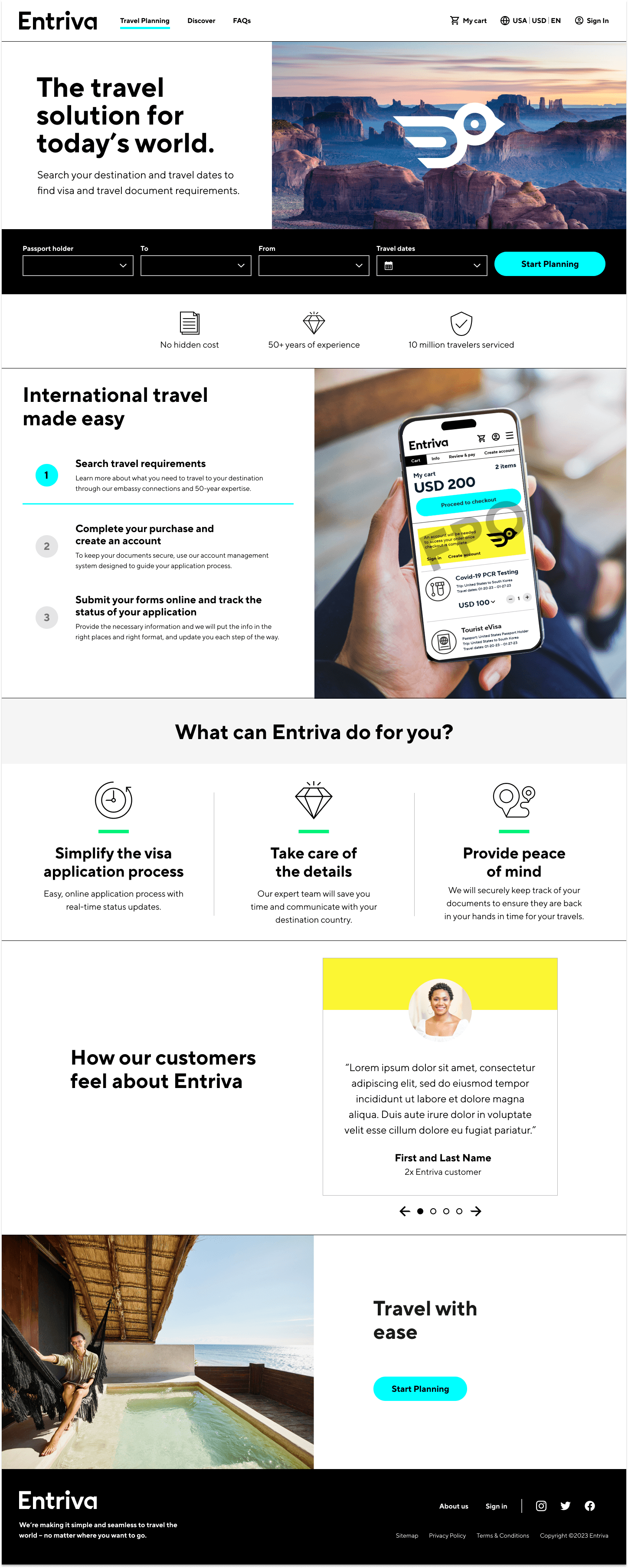
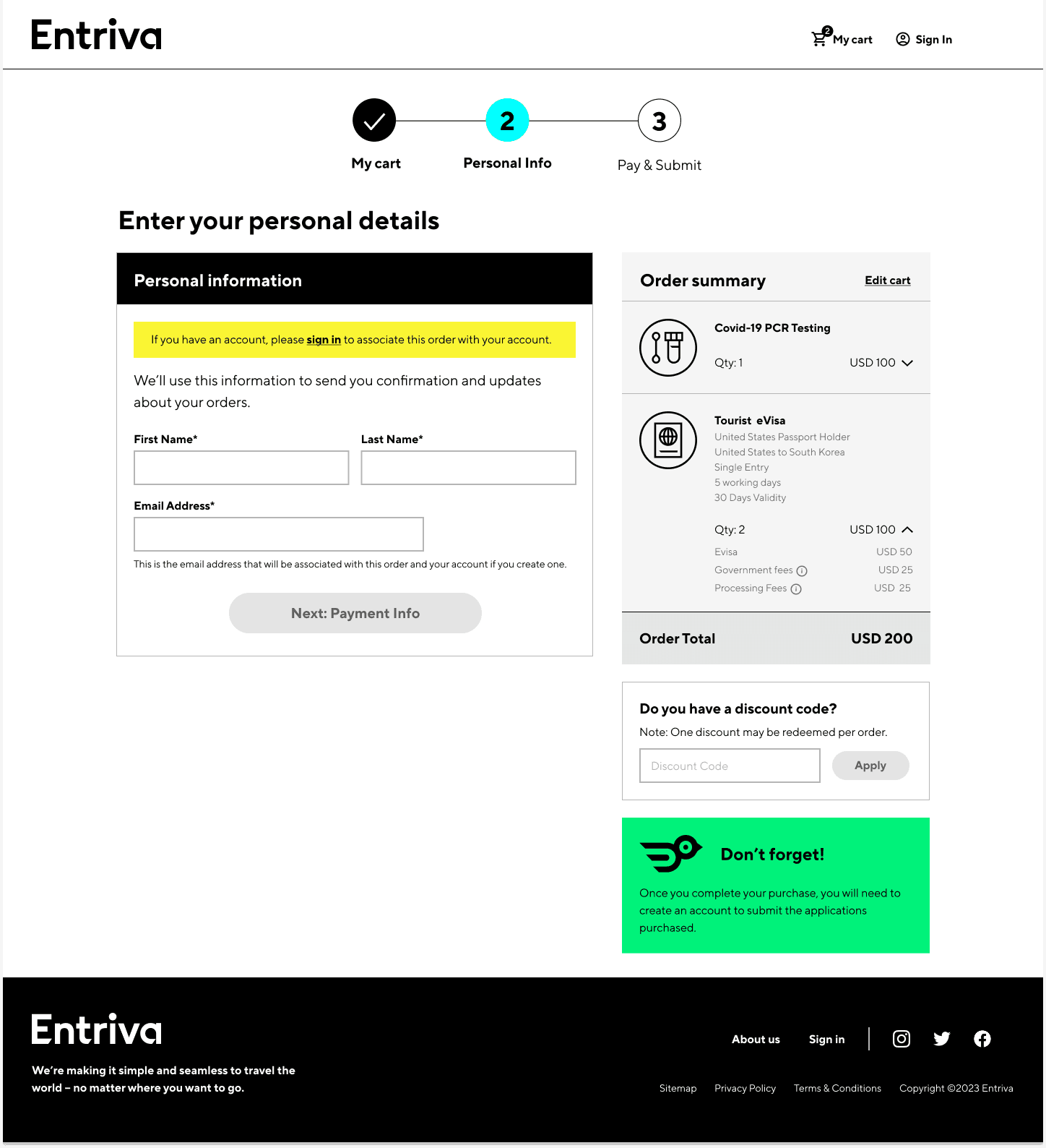
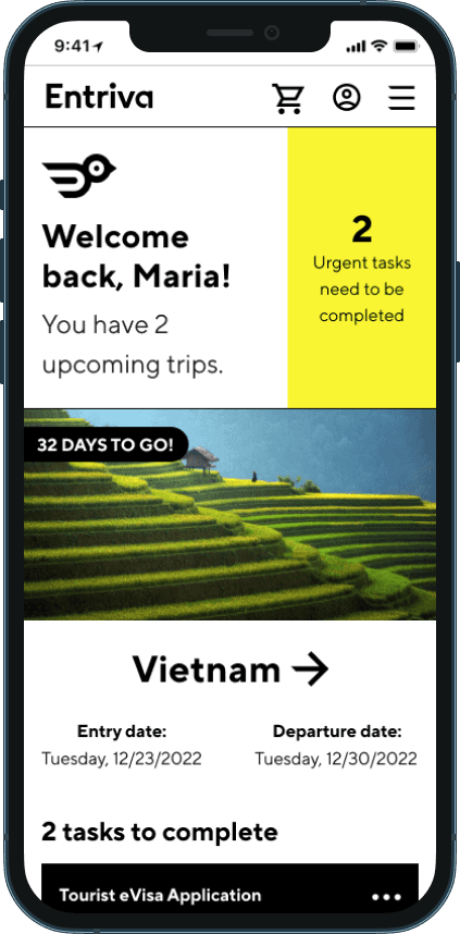
High fidelity mockups
After CIBT and S&G finalized the brand, our second engagement focused on creating high-fidelity mockups within 6 weeks. We collaborated closely through daily stand-ups to apply the brand guidelines and design additional interfaces.


What I learned
Design using real breakpoints. When working in Figma designs don't always translate 1:1. By working in real screen sizes you can avoid layout issues to get as accurate as possible to your screens being in real use.
Work closely with external partners, and don’t be afraid to question guidelines. In hindsight, I should’ve challenged the color direction from Siegel & Gale, as some choices competed with CTAs and urgent messages. Using more restrained color or varied tints could have better emphasized key interface elements.